Difference between revisions of "Buttons"
m (→Device fields) |
|||
| (3 intermediate revisions by 3 users not shown) | |||
| Line 269: | Line 269: | ||
}} | }} | ||
== Device fields == | == Device fields == | ||
<section begin=deviceFields/> | |||
=== Small button, Hybrid button & Twist handle === | === Small button, Hybrid button & Twist handle === | ||
{|class="wikitable" | {|class="wikitable" | ||
! YOLOL field | ! YOLOL field | ||
| Line 315: | Line 314: | ||
! '''ButtonEnableBlink''' | ! '''ButtonEnableBlink''' | ||
| When enabled the button will light up periodically. | | When enabled the button will light up periodically. | ||
| '''0''' = No blinking, '''1''' = Blinking | | '''0''' = No blinking, '''1''' = Blinking (Number sets the interval) | ||
|} | |} | ||
=== Simple buttons | === Simple buttons === | ||
{|class="wikitable" | {|class="wikitable" | ||
! YOLOL field | ! YOLOL field | ||
! description | ! description | ||
| Line 329: | Line 326: | ||
! '''ButtonState''' | ! '''ButtonState''' | ||
| The name of the field of which value the button modifies. | | The name of the field of which value the button modifies. | ||
| 0/1 | | 0/1 | ||
|- | |- | ||
!'''ButtonStyle''' | !'''ButtonStyle''' | ||
| Line 338: | Line 335: | ||
| Sets the color of the button. | | Sets the color of the button. | ||
| '''0''' = Blue, '''1''' = Red, '''2''' = Green, '''3''' = White, Anything else = Blue | | '''0''' = Blue, '''1''' = Red, '''2''' = Green, '''3''' = White, Anything else = Blue | ||
|} | |||
=== Switch === | |||
{|class="wikitable" | |||
! YOLOL field | |||
! description | |||
! range | |||
|- | |||
! '''SwitchState''' | |||
| The name of the field of which value the button modifies. | |||
| -1/0/1 | |||
|- | |||
!'''SwitchStyle''' | |||
| Controls the interaction type of the button | |||
|'''0:''' Hold down and release '''1:''' Toggle (-1/0/1) '''2:''' Toggle (-1/1) | |||
|- | |||
! '''SwitchColor''' | |||
| Sets the color of the button. | |||
| '''0''' = Black, '''1''' = Red, '''2''' = Orange, '''3''' = Green, '''4''' = Blue, Anything else = Black | |||
|} | |} | ||
| Line 369: | Line 386: | ||
! '''ButtonEnableBlink''' | ! '''ButtonEnableBlink''' | ||
| When enabled the button will light up periodically. | | When enabled the button will light up periodically. | ||
| '''0''' = No blinking, '''1''' = Blinking | | '''0''' = No blinking, '''1''' = Blinking (Number sets the interval) | ||
|} | |} | ||
<section end=deviceFields/> | |||
To learn more about the usage of fields, consult these wiki pages: | To learn more about the usage of fields, consult these wiki pages: | ||
Latest revision as of 22:11, 20 October 2023
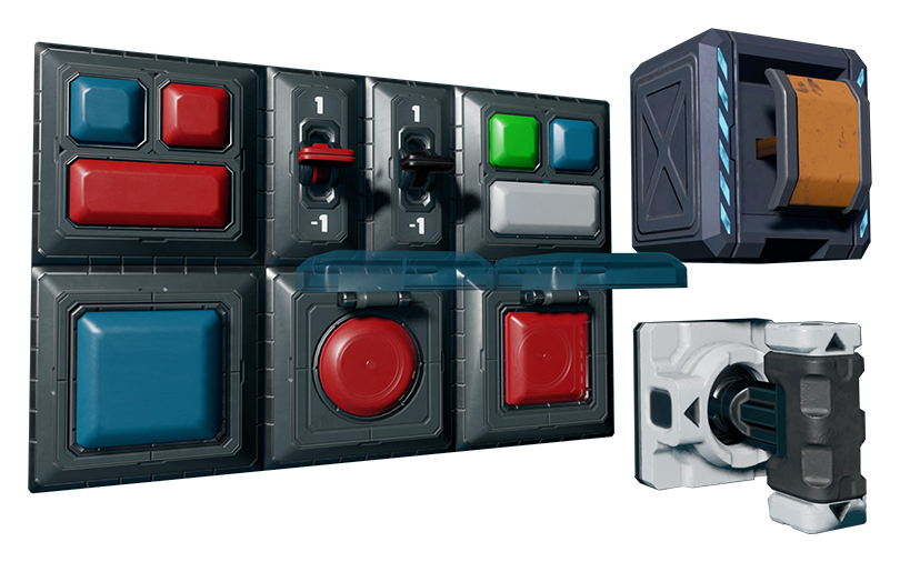
Buttons come in many different shapes, sizes, and colors, but all serve the same purpose: Toggling device field values. While some buttons like the simple button 12×12 or the switch can only toggle between preset values, others can have customized on and off states applied when triggered. This is particularly useful to avoid using YOLOL to interpret button states.
Basic information
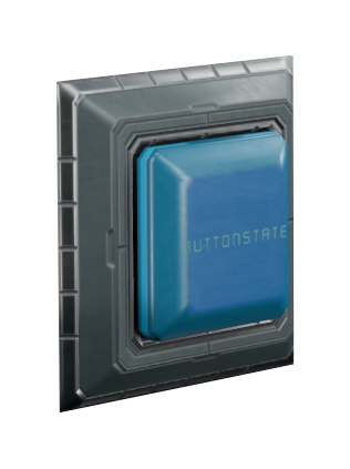
Hybrid buttons are 24×24cm, support custom on/off states, and have a label on their faces that indicate which device field they modify.
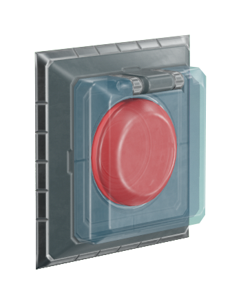
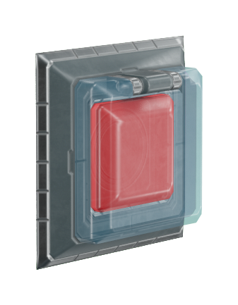
Safety lid buttons are 24×24 cm, and have a physical shield in place over them which must be interacted with before the button can be pressed. These buttons support custom on/off states, and also support coloring via their device fields.
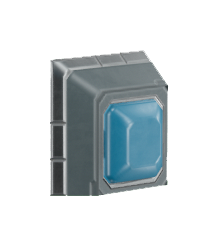
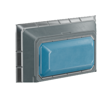
Simple buttons come in 12×12 cm and 12×24 cm sizes, and support coloring via their device fields.
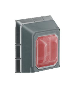
Warning light buttons are 12×12 cm, and support custom on/off states, coloring, and a blinking back-light which can be turned on and off.
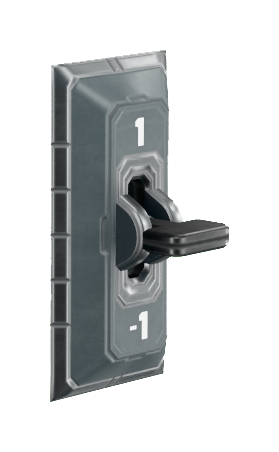
Switches are 12×24cm, and output one of three states: -1, 0, 1. They also support coloring via their device fields.
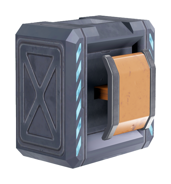
Small buttons are approximately 30×30×36 cm, and support custom on/off states.
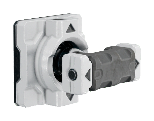
Twist handles are approximately 24×24×36 cm, and support custom on/off states. These are most typically used to control the flow of propellant tanks.
Configuring a button:
- Set the ButtonState field name to match the device field you want to control.
- Set the On- and Off-state values.
- Pressing the button changes its state depending on ButtonStyle -field value.
- Buttons with the "ButtonColor" field can have a different button color depending on the value of this field.
Types
Device fields
Small button, Hybrid button & Twist handle
| YOLOL field | description | range |
|---|---|---|
| ButtonState | The name of the field of which value the button modifies. | ButtonOnStateValue / ButtonOffStateValue |
| ButtonOnStateValue | Controls the value when pressed | |
| ButtonOffStateValue | Controls the value when released | |
| ButtonStyle | Controls the interaction type of the button | 0: Hold down and release 1: Basic Toggle (in-game button remains down while it is "on") 2: 4-state switch (in-game button returns to the unpressed position whether it is "on" or "off") |
Warning light button
| YOLOL field | description | range |
|---|---|---|
| ButtonState | The name of the field of which value the button modifies. | 0/1 |
| ButtonStyle | Controls the interaction type of the button | 0: Hold down and release 1: Basic Toggle (in-game button remains down while it is "on") 2: 4-state switch (in-game button returns to the unpressed position whether it is "on" or "off") |
| ButtonColor | Sets the color of the button. | 0 = Red, 1 = Orange, 2 = Green, 3 = Blue, Anything else = Red |
| ButtonEnableBlink | When enabled the button will light up periodically. | 0 = No blinking, 1 = Blinking (Number sets the interval) |
Simple buttons
| YOLOL field | description | range |
|---|---|---|
| ButtonState | The name of the field of which value the button modifies. | 0/1 |
| ButtonStyle | Controls the interaction type of the button | 0: Hold down and release 1: Basic Toggle (in-game button remains down while it is "on") 2: 4-state switch (in-game button returns to the unpressed position whether it is "on" or "off") |
| ButtonColor | Sets the color of the button. | 0 = Blue, 1 = Red, 2 = Green, 3 = White, Anything else = Blue |
Switch
| YOLOL field | description | range |
|---|---|---|
| SwitchState | The name of the field of which value the button modifies. | -1/0/1 |
| SwitchStyle | Controls the interaction type of the button | 0: Hold down and release 1: Toggle (-1/0/1) 2: Toggle (-1/1) |
| SwitchColor | Sets the color of the button. | 0 = Black, 1 = Red, 2 = Orange, 3 = Green, 4 = Blue, Anything else = Black |
Safety lid buttons
| YOLOL field | description | range |
|---|---|---|
| ButtonState | The name of the field of which value the button modifies. | ButtonOnStateValue / ButtonOffStateValue |
| ButtonOnStateValue | Controls the value when pressed | |
| ButtonOffStateValue | Controls the value when released | |
| ButtonStyle | Controls the interaction type of the button | 0: Hold down and release 1: Basic Toggle (in-game button remains down while it is "on") 2: 4-state switch (in-game button returns to the unpressed position whether it is "on" or "off") |
| ButtonColor | Sets the color of the button. | 0 = Red, 1 = Orange, 2 = Green, 3 = Blue, Anything else = Red |
| ButtonEnableBlink | When enabled the button will light up periodically. | 0 = No blinking, 1 = Blinking (Number sets the interval) |
To learn more about the usage of fields, consult these wiki pages:
