Difference between revisions of "Buttons"
Jump to navigation
Jump to search
m (Added minor information regarding the new buttontypes and fields.) |
(→Device fields: Added simple button colour fields and added titles for the device fields) |
||
| Line 54: | Line 54: | ||
Some Buttons have additional fields, which are listed below. | Some Buttons have additional fields, which are listed below. | ||
{|class="wikitable" | {|class="wikitable" | ||
! colspan="3" style="text-align: center" |Warning Light Button 12x12 cm | |||
|- | |||
! YOLOL field | ! YOLOL field | ||
! description | ! description | ||
| Line 60: | Line 62: | ||
! '''ButtonColor''' | ! '''ButtonColor''' | ||
| Depending on this field the Button will appear in a different color. | | Depending on this field the Button will appear in a different color. | ||
| 1 = orange; 2 = green; 3= blue; any other number = red | | 0 = red; 1 = orange; 2 = green; 3= blue; any other number = red | ||
|- | |- | ||
! '''ButtonEnableBlink''' | ! '''ButtonEnableBlink''' | ||
| When enabled the button will light up periodicaly. | | When enabled the button will light up periodicaly. | ||
| 0 = no blinking; 1 = blinking. | | 0 = no blinking; 1 = blinking. | ||
|} | |||
{|class="wikitable" | |||
! colspan="3" style="text-align: center" |Simple Button 12x12 cm | |||
|- | |||
! YOLOL field | |||
! description | |||
! range | |||
|- | |||
! '''ButtonColor''' | |||
| Depending on this field the Button will appear in a different color. | |||
| 0 = blue; 1 = red; 2 = green; 3= white; any other number = blue | |||
|} | |} | ||
[[Category:Devices and machines|Buttons]] | [[Category:Devices and machines|Buttons]] | ||
Revision as of 12:10, 17 March 2021
Summary

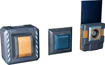
Universally there are two types of buttons that are commonly used; hybrid buttons and small buttons. Both have adjustable interaction styles.
Hybrid buttons are modular, and can connect to adjacent modular displays. Small buttons have their own cable port.
Basic information
Configuring a button:
- Set the ButtonState field's name to match the device field you want to control.
- Set the On- and Off-state values.
- Pressing the button changes its state depending on ButtonStyle -field value.
- Buttons with the "ButtonColor" field can have a different buttoncolor depending on the value of this field.
- There are different types of buttons with varrying size. However they all share most of their fields and behavior.
Device fields
To learn more about the usage of fields, consult these wiki pages:
| YOLOL field | description | range |
|---|---|---|
| ButtonState | The name of the field of which value the button modifies | |
| ButtonOnStateValue | Controls the value when pressed | |
| ButtonOffStateValue | Controls the value when released | |
| ButtonStyle | Controls the interaction style of the button | 0: Hold down and release 1: Basic Toggle (in-game button remains down while it is "on") 2: 4-state switch (in-game button returns to the unpressed position whether it is "on" or "off") |
Some Buttons have additional fields, which are listed below.
| Warning Light Button 12x12 cm | ||
|---|---|---|
| YOLOL field | description | range |
| ButtonColor | Depending on this field the Button will appear in a different color. | 0 = red; 1 = orange; 2 = green; 3= blue; any other number = red |
| ButtonEnableBlink | When enabled the button will light up periodicaly. | 0 = no blinking; 1 = blinking. |
| Simple Button 12x12 cm | ||
|---|---|---|
| YOLOL field | description | range |
| ButtonColor | Depending on this field the Button will appear in a different color. | 0 = blue; 1 = red; 2 = green; 3= white; any other number = blue |